
Sirena Gelato
Website Redesign
Background
Sirena Gelato is a small family owned gelato shop located in the heart of Fairhaven in Bellingham, Washington. The shop specializes in authentic Italian style gelato, having been taught personally by a third generation gelato maker from Italy. When walking into the shop you’re instantly surrounded by a unique charm throughout the shop that you can’t experience anywhere else.
The Problem
The problem is, unless you’re walking into the shop yourself, you would never guess that the shop has such a refined charm throughout it. The site needs to better reflect the same tone that a customer feels when entering the shop personally. Sirena Gelato has little to no online presence at the moment. Their website feels dated and in some places unfinished. Some users when first visiting the site thought the webpage had trouble loading fully at first. Navigation through the site seems to be an afterthought, with their flavors being hidden behind their nutrition facts page rather than their own, and no mention of the drinks the shop offers anywhere to be found.
The Solution
Sirena Gelato needs a website redesign that is better branded to the charm and character the small family owned shop has. A more friendly and cohesive visual design will be implemented. Navigation through the site also needs to be reorganized so as to properly show off the gelato itself and the shop’s menu. A more mobile friendly version of the website will also be designed.
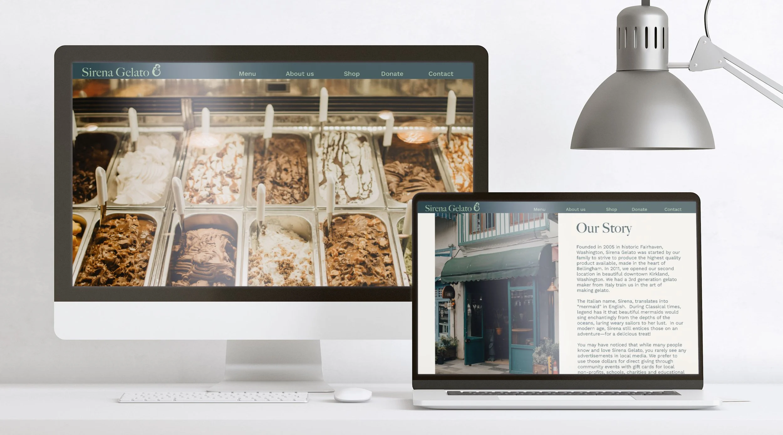


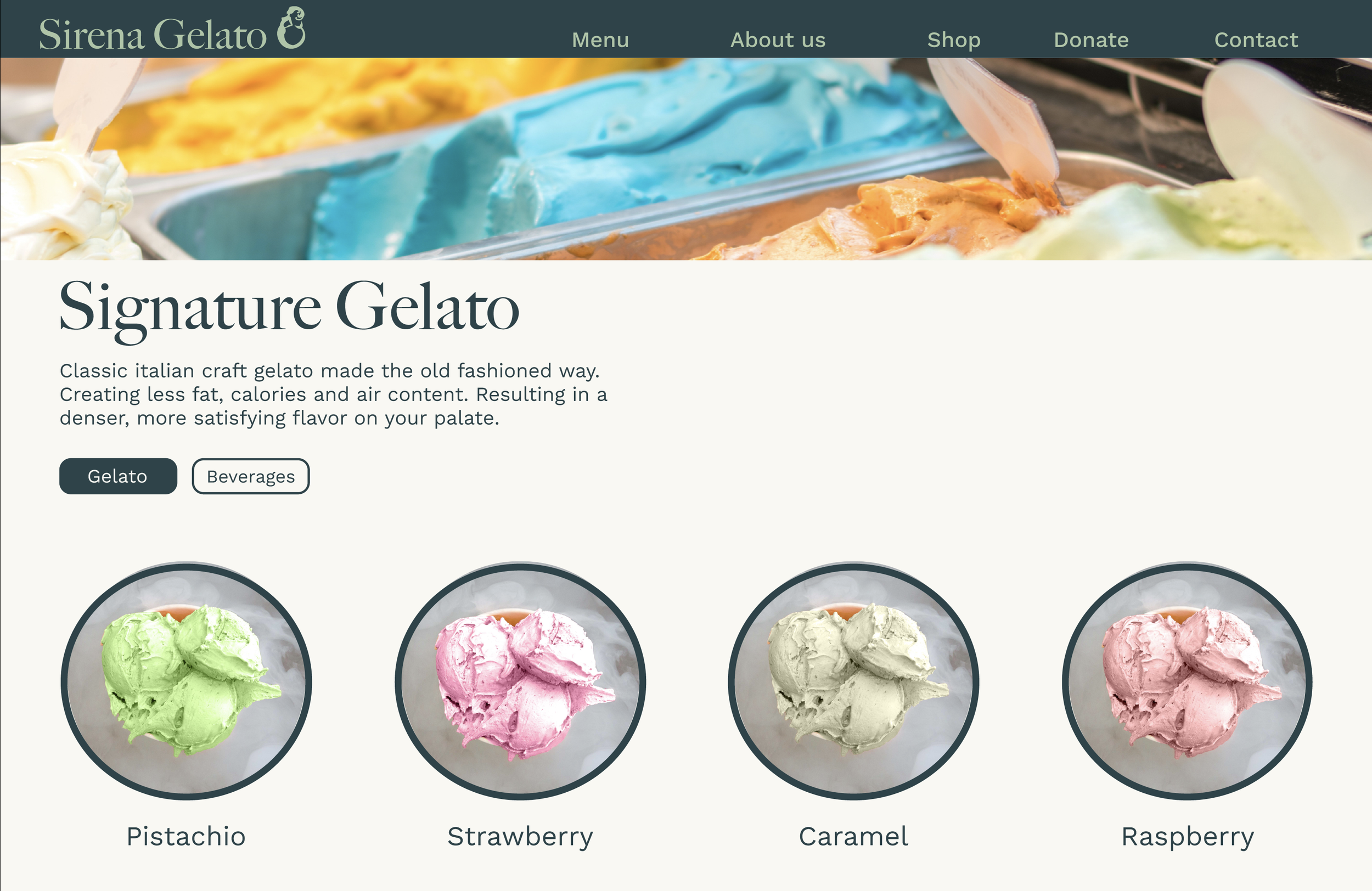
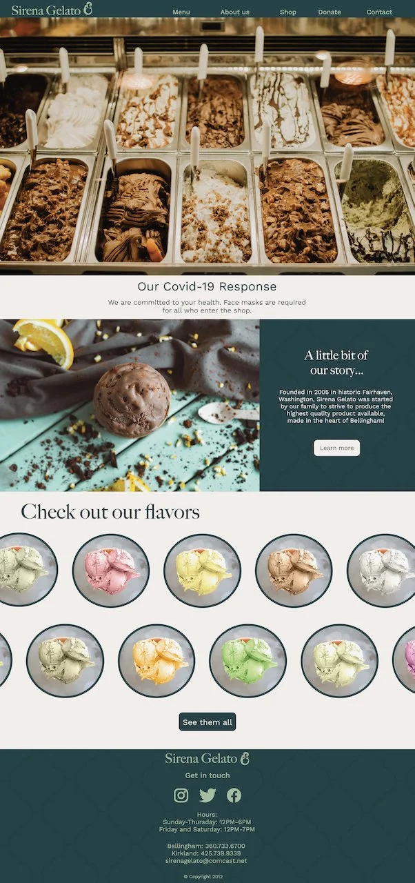
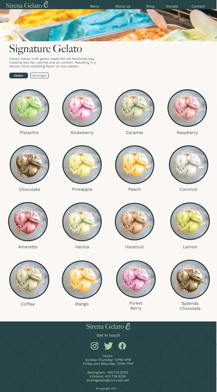
Final desktop screens


Existing website design

Target Audience
Sirena Gelato has a wide target audience, families, students, the elderly, young kids; however, with this redesign, the main target audience is going to skew a bit on the younger side, a group that would feel most comfortable navigating a website. The new design should be easy enough for someone to pull up on their phone and quickly navigate and find whatever information they need, whether they are just checking out the shop for the first time, or looking over the menu while driving to the shop itself.

A redesigned sitemap allows for a more user friendly and intuitive experience navigating throughout the website by better categorizing pages by their content and making vital information such as pricing and nutritional info easily available.
Initial Desktop Designs
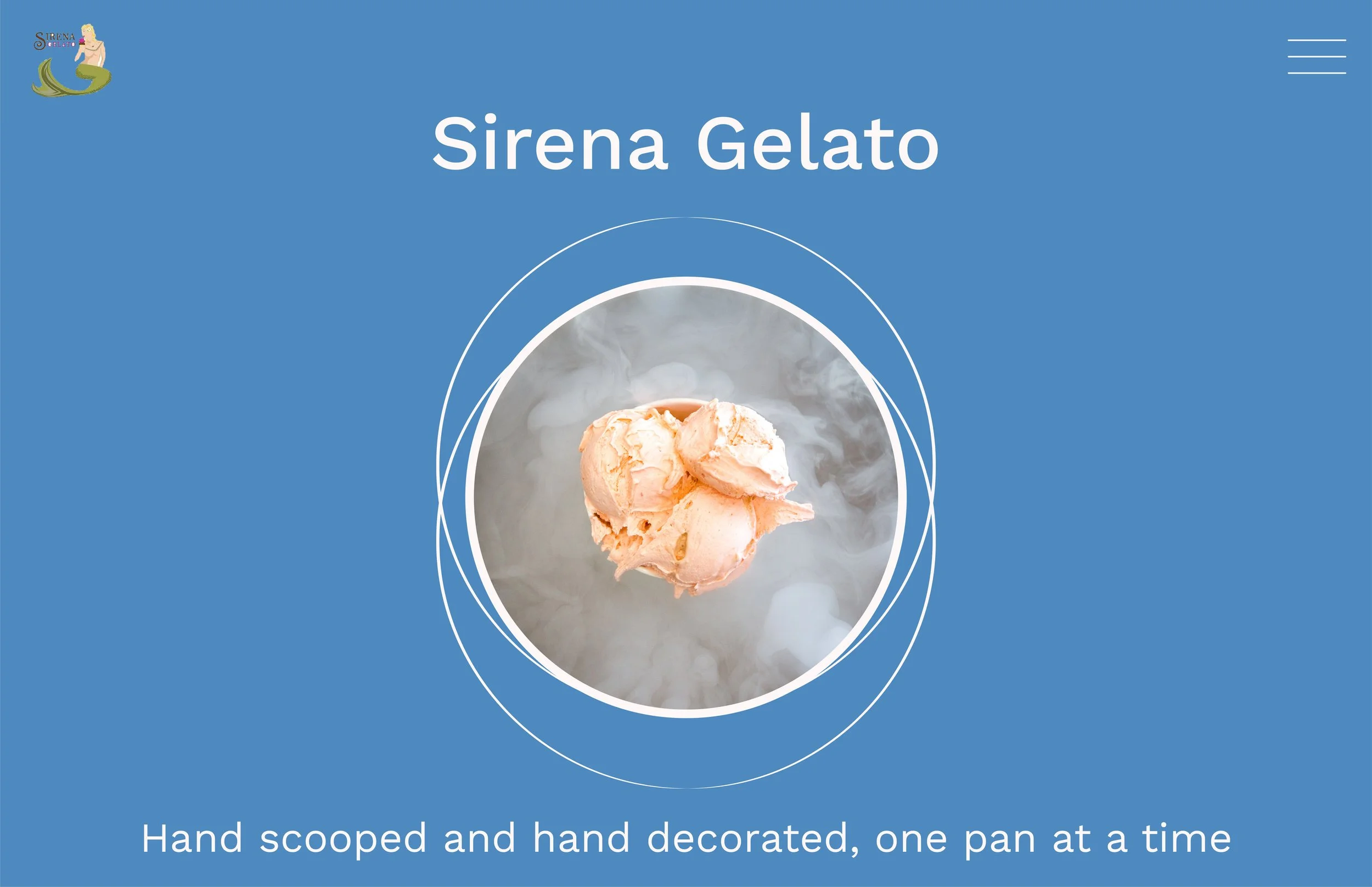

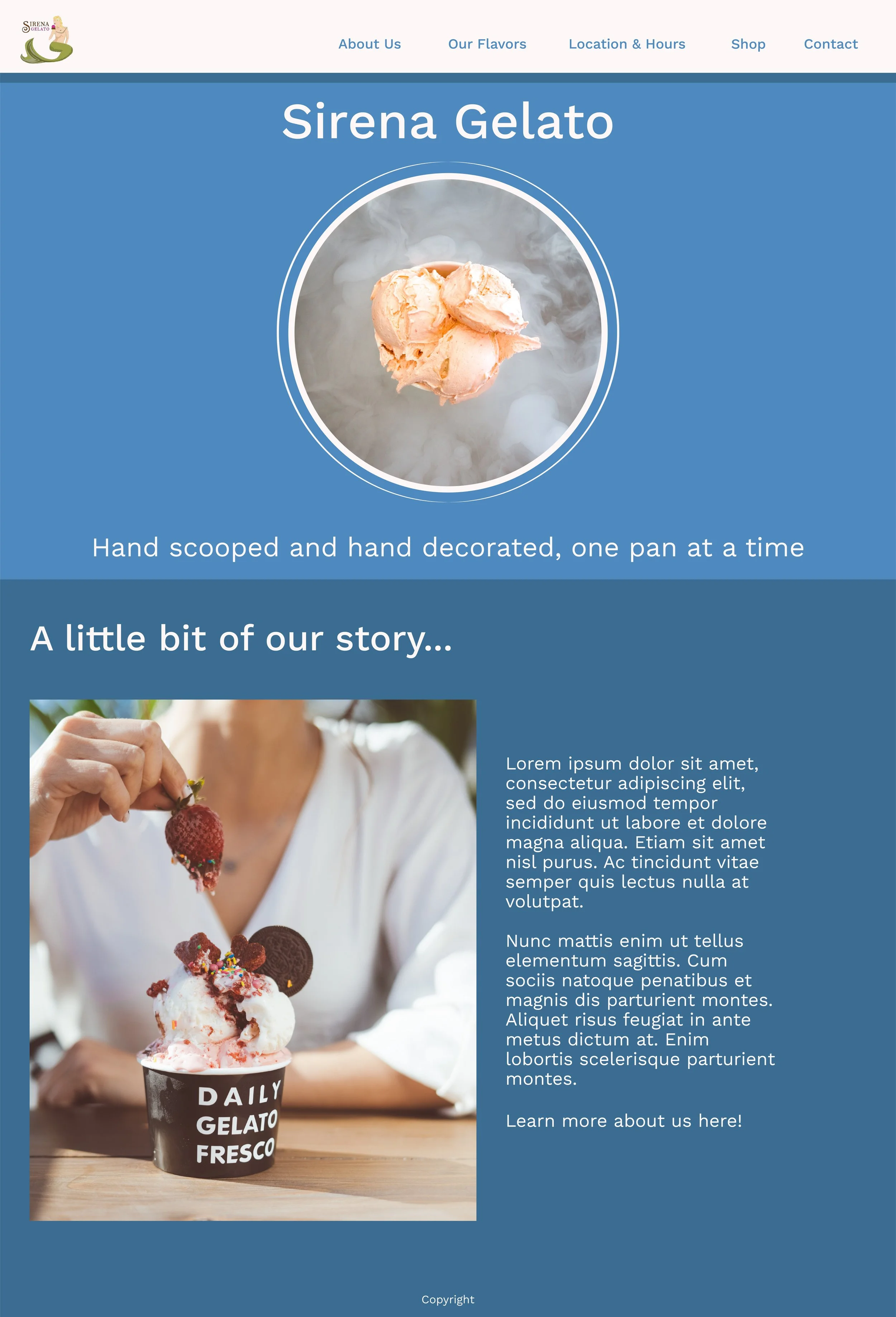
Analysis
Initial design comps were able to establish a more cohesive visual style, however it read more corporate, not accurately showing off the desired charm and refinement of Sirena Gelato. The original logo was used and in testing it was found that users didn’t like it, describing it as feeling more like a sushi shop logo, especially with the difficult to read typography. Moving forward, a more type heavy logo would be incorporated and a stronger color palette.
Revised Desktop Designs


Analysis
Design comp revisions were able to fix some of the issues found in the initial design phase. The color palette was more well received, however some users felt it was still a little too much color. The layout also felt almost patched together. The color palette needed further refinements, as well as the over visual cohesiveness of the website. It was also noted by users at this point, that the about page was a little confusing. The majority of what Sirena Gelato includes in their about section isn’t really about the shop itself, and should be worked on as well to better represent themselves.
Testing also revealed some flaws in site navigation when interacting with elements such as the logos. Users also felt that some light branding could be better incorporated throughout the website.
Revisions
At this point brand guidelines began to be developed. The blue focused color palette was changed feature greens instead. With the visual style more dialed in, the three main pages became the focus of the design comps, the Home page, the Menu, and the About page. The goal was to make sure that the visual style remained cohesive among the main pages.
New Brand Guidelines
Creating brand guidelines where there previously were none allows the new website to have a more cohesive and impactful identity that better represents the shop itself.

Final Full Screen Desktop Designs


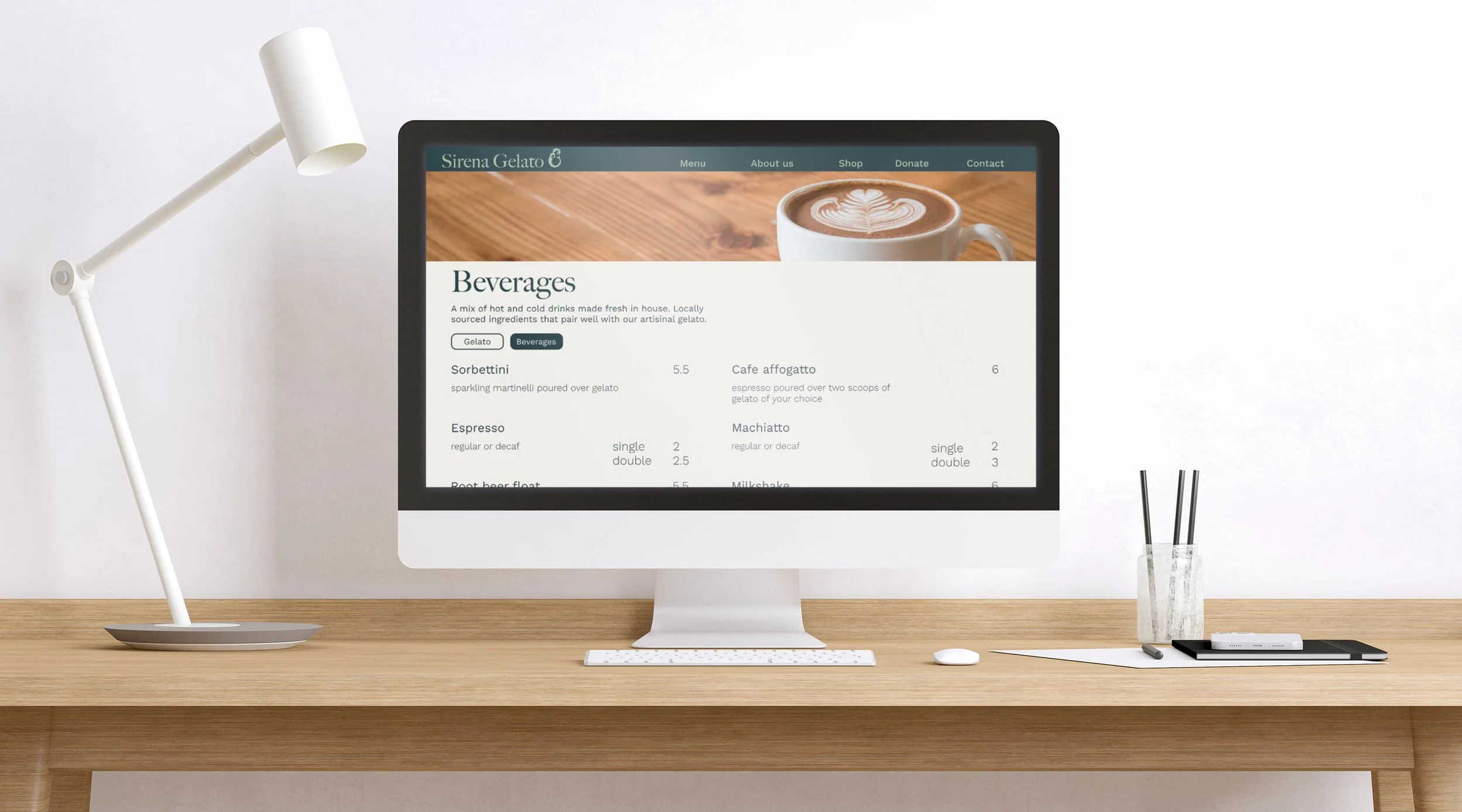
Desktop Screens in Use

Final Full Screen Mobile Designs


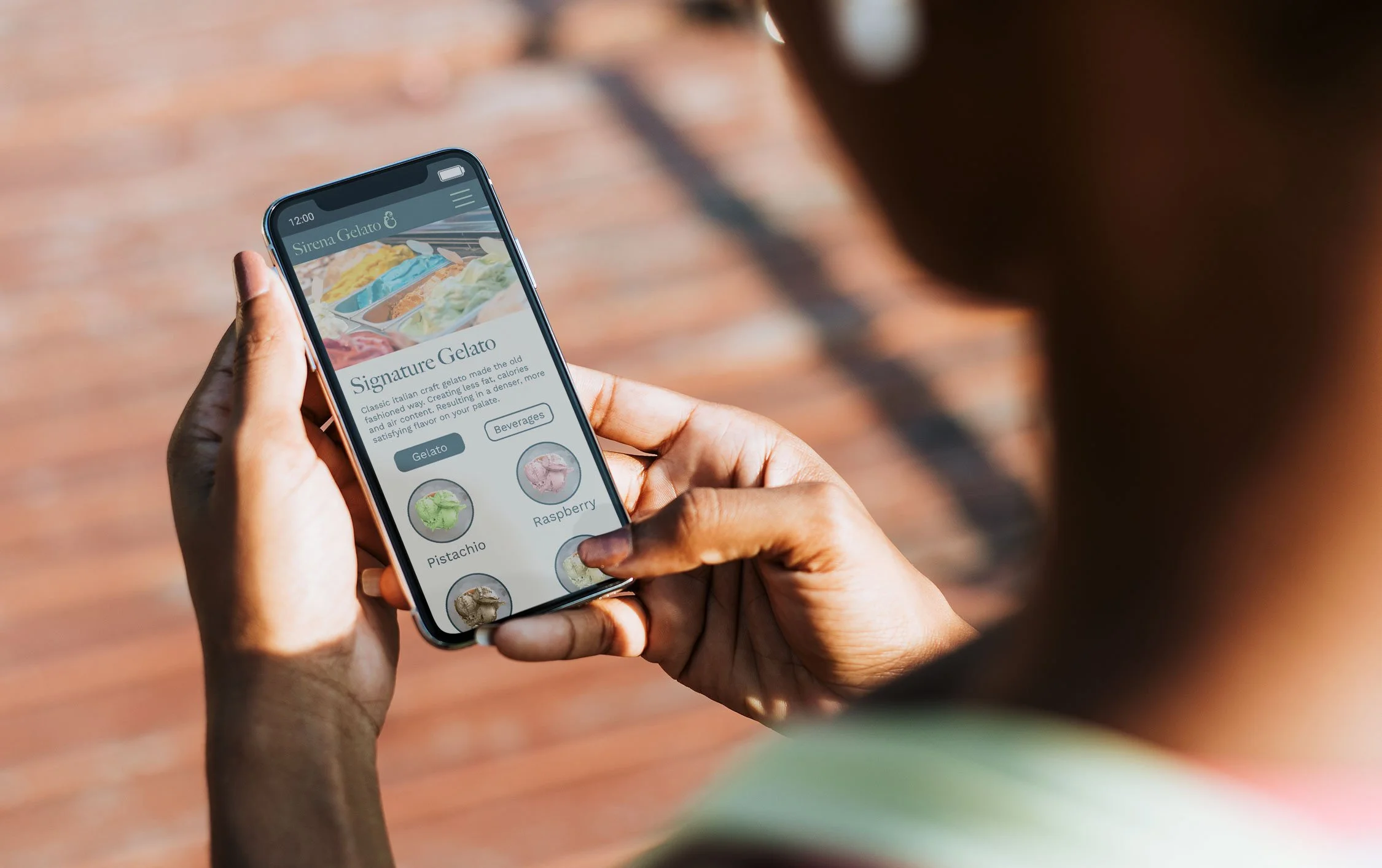
Mobile Screens in Use
